5 Essential Design Solutions for Urban Spaces
I recently had the pleasure of having one of my spaces featured in the premiere issue of Rise. If you’re unfamiliar with the publication, you won’t be for long. It’s hot off the presses from New England Home—their first-ever urban design magazine.
It was extra special for me to see this particular project included, because it was a project I worked on with some longtime clients of mine. In fact, this was our seventh venture together! It’s always fun to work with repeat clients because there’s a combined level of comfort; an added layer of trust; and, as a designer, I have a strong sense of how they live and what their style is. It makes for a smooth process all around.
New England Home was smart to recognize the migration of people moving downtown and meet that demand by creating Rise. If you’re finding yourself in a similar situation, you’ll likely run into some of the same challenges I frequently do when designing for the downtown scene.
Here are some common issues, and my tips for dealing with them:
space
Without a doubt, space is the biggest challenge in an urban space, so be thoughtful about how you can maximize every square inch. At the start of every project, we spend a lot of time talking about your lifestyle and brainstorming multifunctional, creative, space-saving solutions to meet the needs of how you will really use your space. Whether it’s wall-hung shelves, built-ins, or cabinetry that goes all the way up to the ceiling, vertical space can be a lifesaver for storage. At the end of the day, sometimes we decide customization is the best solution. In the living room featured in Rise, we had the sofa customized for the length of the wall, and the tri-level coffee table was designed to take up a small footprint, but provide lots of surface area.
neighbors
Sound is always an issue when designing for city living. Good insulation in the walls is important if you are starting with a blank slate and able to add it. If you don’t have control of that, make strategic use of acoustical elements, such as rugs and window treatments to help with echoing.
PRIVACY
Everyone loves an amazing view, but no one wants to feel like they’re living in a fishbowl—especially when the sun goes down. Window treatment technology has really come a long way in solving for this challenge. In my project featured in Rise, the technology is actually integrated into the ceiling! Stationary panels give a soft drapery look, but above you’ll find roller shades that are operated by remote control.
WARMTH
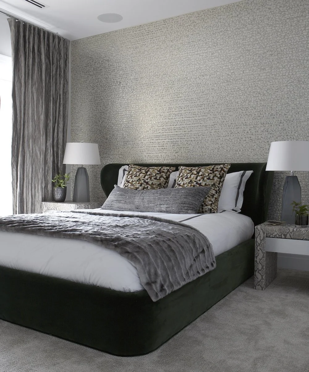
It takes some extra effort to bring a sense of warmth to a space that’s surrounded by glass, metal, and concrete. A well-layered design approach helps to counterbalance all the harder surfaces. Wall coverings are one of my favorite ways to add more interest and extra depth to an urban space.
SENSE OF PLACE
I always like to give a nod to the environment without it being themed or looking too obvious. For example, metallic finishes give a hip edge in a downtown space and reference back to the water. Different textures can evoke a sense of place, and layering them is a fun way to play with materials. The goal is to create a space that complements—doesn’t compete with—the city environment and spectacular views.
I hope these tips were helpful.
Until next time,


