The Do’s and Don’ts of Using Bold Wallpaper
Wallpaper can truly transform a space and it’s one of the easiest ways to add that “WOW” factor to your home. Here’s a short guide to choosing the right wallcovering, including some insider advice on the brand names we trust!
One of our favorite elements of a room when designing schemes for clients is you guessed it...wallpaper! Choosing a bold wallcovering can be a leap-of-faith sometimes but the end result is worth the angst. When used effectively, patterned walls take center stage and create a focal point with a major WOW factor. The best part is, you won’t need expensive art when you’re finished...just let the wallpaper do the talking! Let’s look at a few examples.
DO: Pair large-scale patterns with a heavy dose of solids.
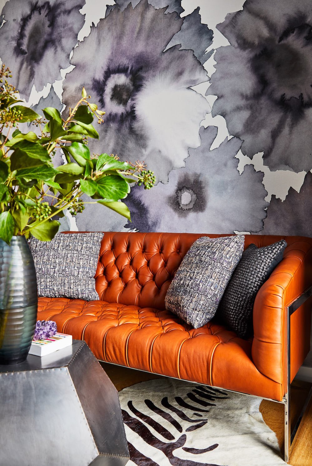
In this luxe loft in the South End of Boston, the office was tucked in a corner room with expansive views and three blank white walls. We made an eye-popping statement with a large-scale print (by Phillip Jeffries) and paired it with lacquered eggplant cabinetry and a tufted leather couch for a touch of masculinity. The solid leather against the large scale print helps ground the room and give the eyes a place to rest.
DO: Use wallpaper as an accent wall in a bedroom, or if the budget allows go all in!
One of our go-to sources for wallpaper is Phillip Jeffries and this strie of ocean-blues was perfect for this boutique hotel, called “Summercamp”, on Martha’s Vineyard. You’ll notice that the bedding is mostly white with patterned pillows and a fun grass-green headboard in a small-scale print. Imagine this room with white walls, or a solid paint color, and it wouldn’t be half as interesting. The wallpaper in this instance was used as an accent wall behind the bed, and the movement of the strie works perfectly for this ocean setting, without being too literal.
Romo’s modern geometric paper in this master bedroom on Cape Cod is another great example of an accent wall in ocean hues. We use wallpaper on the headboard wall in a bedroom as a focal point, though depending on the architecture we’ll carry the print around the room, as in the example below.
DO: Let organic patterns travel throughout the entire space and paper every wall.
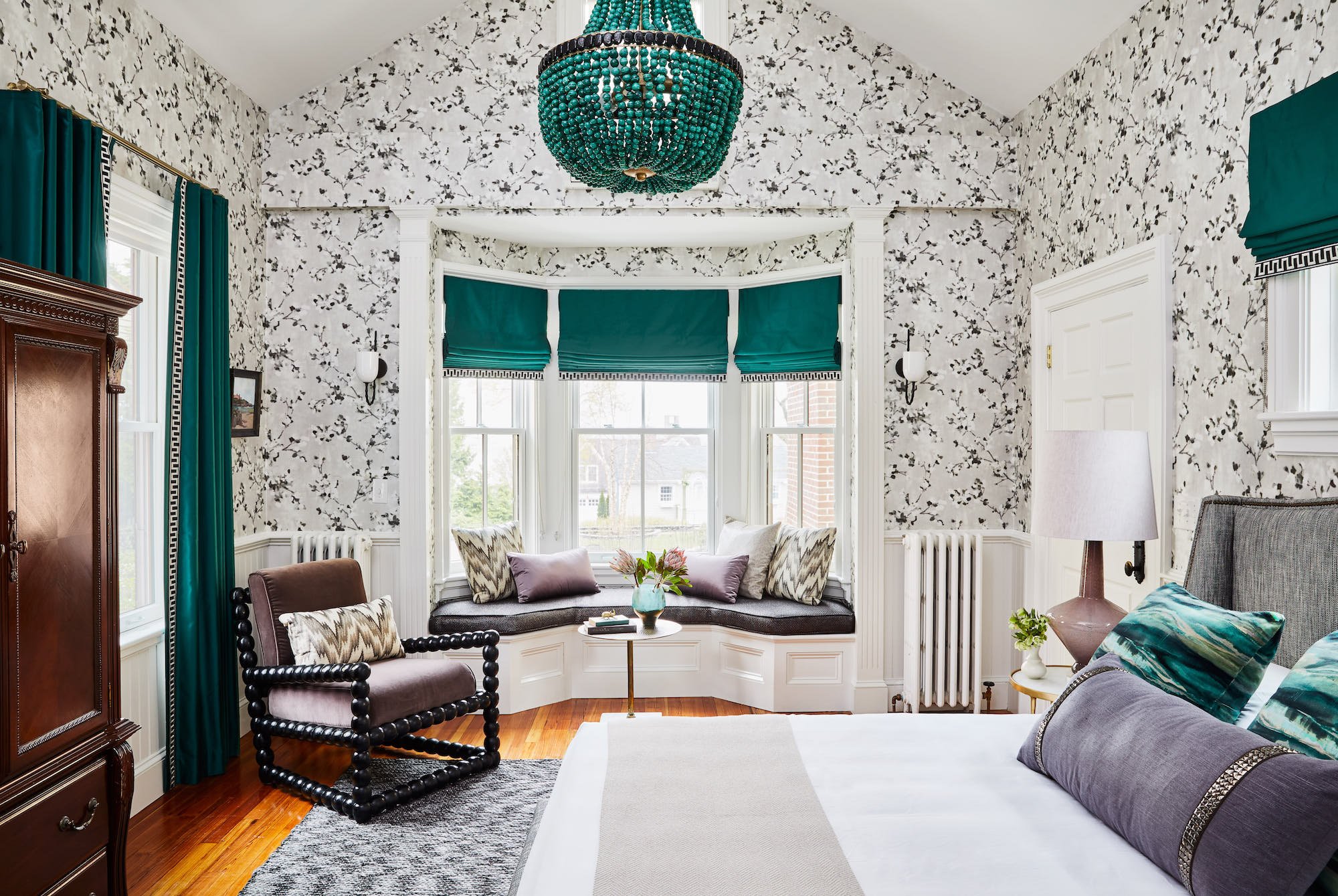
This is one of our favorite rooms at the Cliffside Inn which we designed in Newport, Rhode Island recently. The modern floral works well here in neutral gray tones so it doesn’t overpower the space. The solid teal drapery, upholstery, and white bedding soften the room and keep the design from getting too busy. We opted to paper the entire room so the eye can follow the organic pattern and flow through all of the angles of the architecture. Some decisions are a bit instinctual, and in this room with beautiful features and a pitched ceiling, it seemed unfair to just give just one wall some love.
DON’T: Here’s a short list of things to avoid when using a bold wallpaper.
If you pair artwork with a bold wallcovering, be intentional about the subject matter. You don’t want it to compete with the wallpaper pattern but rather, complement it. Or, skip the artwork altogether and let the wallpaper stand alone so you can see the print in its entirety.
Be careful about using competing large-scale prints in the room. If you want to layer in some coordinating prints make them a much smaller scale.
Avoid using more than one floral print in a room. If you have chosen an organic print like an abstract floral, consider pairing it with a geometric print and/or solids.
Romo, Phillip Jeffries, Schumacher, and LeeJofa are all great sources for wallpaper to name a few, and you can find most of these names through an online reseller. Lindsay Cowles is also a new favorite who isn’t afraid of a bold, modern print. Check these sources out when you get a chance and don’t be afraid to go BIG with your next design choice. Pick one show-stopper pattern and then layer in some coordinating solids and small-scale prints on top. Now is a perfect time to have fun with design and change things up inside...DON’T WAIT!
Until next time,


